SYNERGY TRAINING SOLUTIONS
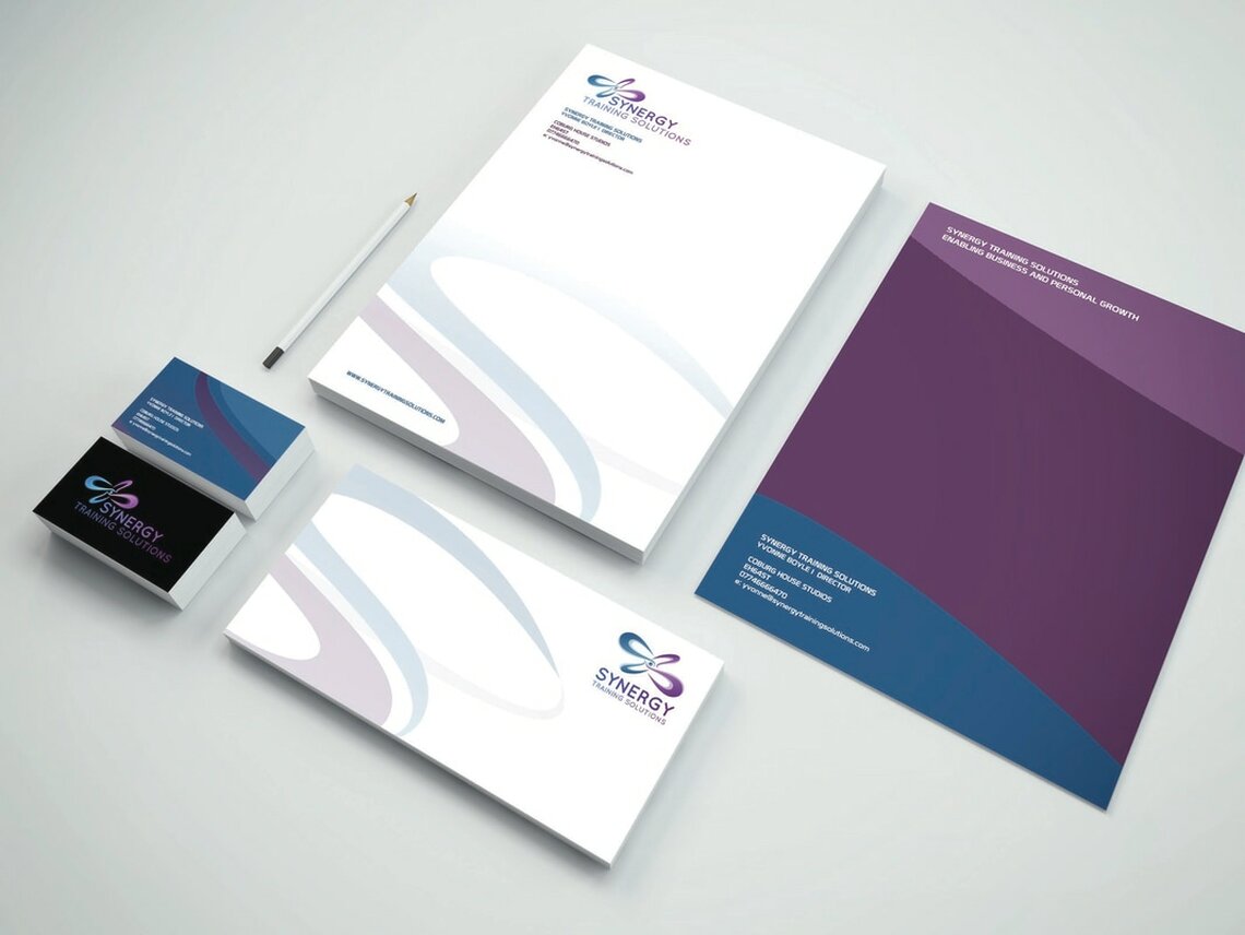
I was approached by Synergy Training Solutions, a training consultancy agency, to develop a more contemporary and refined branding style for them to use across their business.
They required something simple, but recognisable, a logo that communicated the coming together of ideas and efficient business practices.
The final logo was an elegant way of presenting this concept, a looping shape that flows and feeds into itself, sustaining it's own form. From this logo, I developed a colour scheme and set of stationary that added a cohesive brand identity to the business.


